Wednesday, December 12, 2012

STANDARDS & GUIDELINES:

Who we are: We are the second largest natural gas and oil producers in the United States.

What we do: We provide clean, all-American, affordable and abundant natural gas using innovative technological and geographical advancements.

Why it matters: We satisfy millions of customers on residential, commercial and industrial levels while improving the country through proper use of natural energy.

Identity change: We want Chesapeake to have a strong brand. Moving forward from an amateur, out-of-date identity that has been around since the company was formed in 1989, we want to create an identity system that works for the company.


The STANDARDS AND GUIDELINES for Chesapeake defines a vocabulary for the brand that informs every step of the brand experience through logo and advertising. It ensures proper management and control and maintains integrity of the brand so that the brand consistently evokes the desired response. The style-guide properly accommodates the demand of the audience and remains true to meeting the core emotional needs of the individual consumers.

IDENTITY APPLICATIONS:

Final Identity Applications:

Website:    www.chk.com
A special horizontal logo has been designed for web and mobile application purposes only, to better fit the context. Integrity of the logo is kept by keeping the logo elements proportionate. Primary colors, fonts, and consistent objective photography is used with a clean, simple layout to compliment the core values of the identity system.


Mobile App: Chesapeake Mobile. The horizontal logo is used here again in context. Similarly using the primary colors, fonts and objective photography, the mobile application shares the same clean, sophisticated and simple layout that Chesapeake's website has.


Calling Card: Professional business card. Simple, clean and incorporating all of the appropriate brand elements and colors, the business card represents the identity system well.


Stationary: Professional letterhead. Simple, clean and incorporating all of the appropriate brand elements and colors, the letterhead along with the business card represents the identity system well.


FINAL IDENTITY:

Final Identity Solution:


IDENTITY ROUND 2:


IDENTITY ROUGHS:


MOOD BOARDS/IDENTITY CONCEPTS:

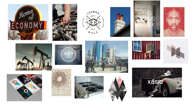
MOOD BOARD CONCEPT 1: Brand strategy, emphasizing the company's economical role as a clean, earth-friendly natural gas company, concentrating on a green-earthly palette.


MOOD BOARD CONCEPT 2: Brand strategy, giving the company a more industrial, contemporary feel, drawing from a more muted palette, giving the sense of efficiency and precision.


MOOD BOARD CONCEPT 3: Brand strategy, incorporating a more lively, color-based identity, drawing bold color from drilling environments to give life to its operation. To brand the company as fresh and innovative emphasizing itself as a leader in the industry.


MOOD BOARDS:

MOOD BOARD #1 RESEARCH

History: Chesapeake was founded in 1989 with only a $50,000 initial investment in South-Central Oklahoma. To date, they have established production on approximately 6.6 million net acres, securing its position as the second-largest producer of natural gas, a top 15 producer of oil and natural gas liquids and the most active driller of new wells in the US.

Mission: The company provides clean, all-American, affordable, abundant natural gas.

Key Audiences: Most US homes have access to a source of natural gas from one of Chesapeake's local distribution companies. Residential uses include stove cooktops, dryers, and home heating. Commercial uses include heating and cooling offices, schools and hospitals. Industrial uses include preheating metals, glass melting and food processing. Power generation includes operation of gas turbines to create electricity. Transportation fuel includes transit buses, trucks, vans and passenger cars.


Competition: 1. Exxon Mobil (red, white & blue, bold, loud, global) 2. Anakardo (blue, cool, sleek, historical, geographical) 3. Devon Energy (red & black & grey, scientific, innovative, precise) 4. BP (green, earth-friendly, economic, innovative) 5. Encana: blue & green, similar to Chesapeake, ameteur)

Current Identity: It is apparent that besides their logotype, Chesapeake is completely lacking in identity, besides an old B&W logotype. It seems that their current identity and brand has been around since it was formed. Their lack of identity is consistent across the board and makes them weak in comparison to biggest competitor, Exxon Mobil.

STRATEGIC RECCOMENDATIONS:

Vision: Be the solution, substitute for expensive, foreign oil and dirty coal.

Values: Provide clean, all-American, affordable, abundant natural gas.

Mission: Continue leading the industry with the latest technological and geographical advancements.

Target Market: Support the American consumer in all residential, commercial and industrial uses.

Services: Stove cooktops, dryers and home heating, heating and cooling offices, schools and hospitals, preheating metals, glass melting and food processing, operation of gas turbines to create electricity, transit buses, trucks, vans and passenger cars.

Competition: Differentiate by providing a quality product.

Pricing: Offering quality, affordable gas in relation to cheap, expensive oils.

Distribution: Availability through local distribution companies to those who care about quality and efficiency.

Environment: Environmentally friendly with a pledge to improve the country through proper use of natural energy.

Threats: Other large competitors with better branding and marketing.

Core Values: efficiency and quality

Brand Strategy: Clean identity representational of its clean, eco-friendly product

Differentiation: Unique and innovative identity

Key Messages: Natural gases are abundant and can help improve the country by substituting expensive oils and dirty coals.

Unified Concept: Chesapeake cares about those who care.

The Big Idea: Creating the perception and giving the identity and brand of a high-quality, eco-friendly gas company that provides abundant, clean and affordable natural gas product to consumers nationwide.


Thursday, September 13, 2012

ALTERNATIVE NAMES:

As part of rebranding Chesapeake Energy, I came up with 15 new name solutions to the Fortune 500 company:

Pipeline Energy/Drilling/Solutions (Pipeline as it's main name, one of the other three words as its secondary part): Fitting because it is necessary for the natural gas company to use pipeplines in order to get the natural gas from well heads to market.

Advanced Drilling: Fitting in the sense that the company is a leader in the industry based on its innovative techniques and use of the best and latest technology.

US Energy: Fitting because the company does all of its drilling inside of the country and has helped raise percentage of gas used in the country from North America to 99%.

Alternative Solutions/Drilling/Energy (again all three secondary words could be proposed as part of its headlining name): Fitting because it gives the company an appeal to "green-minded" people due its alternative solution to clean energy.

Abundant Reserves: Fitting because natural gas is not of short supply like other limited and rare resources that are used for energy.

Pure Energy/Drilling/Solutions: Fitting because it emphasizes that oil is cleaner than fossil fuels and emits less carbon dioxide and is ultimately better than oil and coal. It also emphasizes that the company provides a pure solution to a cleaner world.

Top Tier Natural Gas & Oil (Top Tier for short): Fitting because it is self-explanatory and simply states that the company is the best in natural gas and oil products.

New Wells: Fitting due to the fact that the company is the most active driller of new wells in North America. It gives a sense of what the company is about and provides an interesting name.

Modern Chesapeake: Fitting because it gives the sense that the company uses only the most-up-to-date technologies and processes when it comes to drilling and providing natural gases.

Chesa: Fitting because it doesn't not completely eliminate the previous identity, but allows it to be shorter, simpler and easier to remember.

Golden Trend: Fitting because "Golden Trend" was actually the first place that the company started drilling and it implies that what the company does has the most "golden" trends/tactics.

McCle: Fitting because it is the CEO's last name only shortened (McClendon), but it's simple and short and easy to remember.

Horizon Tech: Fitting because of the horizontal drilling that the company does and also gives the sense that the company will be around for a while "on the horizon"?

Geological Driling: Fitting because it is straightforward, gives a sense of what the company is about, but still sounds earth friendly.

Superior Fuel: Fitting because it will suggest that the company is the best in its industry (which it basically is and will be as soon as it is rebranded).


Thursday, September 6, 2012

FURTHER RESEARCH:

A bit more information:

As of Wednesday, Chesapeake Energy announced that it's on track to meet its asset sale goal for the year. They expect to have sold $13 billion to $14 billion in sales by the end of the year.


For a companion with numbers that high, design identity should not be in short supply. As you can see, the system is very bland and would be non-existent if it were not for the logotype. One of the only things that the company's brand/identity has going for it is it's simplicity. It is fairly clean, but still outdated.

COMPANY RESEARCH:

Chesapeake Energy was formed in 1989 with only 10 employees and $50,000 in capital. Since then, they have grown into the second largest producer of natural gas, a top 15 producer of oil and natural gas liquids and the most active driller of new wells.

They are focused on discovering and developing unconventional natural gas and oil fields onshore, and they do it all in the US of A. They strive to provide clean, affordable, abundant and American natural gas. Because of its affordability, availability and cleanliness Chesapeake believes that the natural gas will continue to gain a market share based off of the value gap between natural and oil gas prices.

People, land and science are their three key elements to their company in staying ahead in the industry. From the fields where they drill to the labs where they study petrophysics to the offices where they make the final decisions, Chesapeake keeps up their enthusiasm and commitment in every aspect of their business.


Based off of the press releases, news clippings, annual reports etc. that I skimmed through it became apparent that besides their logotype, Chesapeake is completely lacking in identity. Besides an old B&W logotype, it seems that their current identity and brand has been around since it was formed. Their lack of identity is consistent across the board and makes them weak in comparison to biggest competitor: Exxon Mobil.


As you can see, their identity has not come very far, but has a long to go. Their visual representation would benefit entirely from a complete reconstruct of their brand architecture including their taglines, standards & guidelines, advertising campaigns, videos, blogs, packaging and displays.


CREATIVE BRIEF:

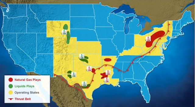
Due to a the fact that two other people out of the not-near-twenty that we have in this class chose Domtar, I decided to change the Fortune 500 company that I sought to reconstruct.  I realized that Chesapeake Energy is in dire need. They are a lead company in the natural gas industry (a close second to Exxon Mobil). The most active driller in the country, Chesapeake operates in 15 different states as an independent company (proving that independent companies are not necessarily small).

Chesapeake, regardless of its status and success, lacks what I consider to be a leading necessity in the design identity of a company: a decent logotype.  I don't mind the type that was used for "Chesapeake" or even "ENERGY", but the image that is incorporated into the logotype is outdated and amateur. After doing a bit of further research I realized that the company's design identity is barely existent. Their website barely has a color-scheme.


I feel like Chesapeake Energy needs a little bit of design TLC. We'll see if I will be able to help them out...


Thursday, August 30, 2012

THE FORTUNE 500:

Domtar is the largest integrated marketer and manufacturer of uncoated freesheet paper in North America. They had revenues of $5.6 billion in 2011, yet their identity system seems lacking in design and sense of brand. http://www.domtar.com/index.asp

The company produces 4.3 million metric tons of hardwood, softwood and fluff pulp every year (I can't fathom that amount, but I do know that's a substantial amount). The products that come from these materials supply a wide and diverse group of customers.

From a design-perspective, I feel like the company needs to re-brand themselves. Their logo seems amateur and does not represent the company and what they have to offer well. The overall identity is not consistent and could be much more engaging for a customer.


INTRODUCTORY POST:

My name is Piper Morgan. I'm a graphic design student at the University of Utah. Current classes this semester include: Environmental Graphics, Illustration and Identity Systems & Brand. A few non-important accomplishments in my life thus far include: swimming with dolphins in Tahiti, accumulating a pointless collection of tea sets and being featured in a headlining newspaper photo.