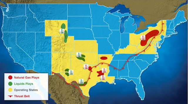
They are focused on discovering and developing unconventional natural gas and oil fields onshore, and they do it all in the US of A. They strive to provide clean, affordable, abundant and American natural gas. Because of its affordability, availability and cleanliness Chesapeake believes that the natural gas will continue to gain a market share based off of the value gap between natural and oil gas prices.
People, land and science are their three key elements to their company in staying ahead in the industry. From the fields where they drill to the labs where they study petrophysics to the offices where they make the final decisions, Chesapeake keeps up their enthusiasm and commitment in every aspect of their business.
Based off of the press releases, news clippings, annual reports etc. that I skimmed through it became apparent that besides their logotype, Chesapeake is completely lacking in identity. Besides an old B&W logotype, it seems that their current identity and brand has been around since it was formed. Their lack of identity is consistent across the board and makes them weak in comparison to biggest competitor: Exxon Mobil.
As you can see, their identity has not come very far, but has a long to go. Their visual representation would benefit entirely from a complete reconstruct of their brand architecture including their taglines, standards & guidelines, advertising campaigns, videos, blogs, packaging and displays.


No comments:
Post a Comment